
From late 2017 to early 2019, Home Page of the Tokopedia iOS application was built using React Native. In that time, we loved so much using React Native cause it has Hot Reload features that make our work faster without need to compiling a whole application when we need to work on Home Page. And often we use the power of Code Push when there’s a problem on the version we just released on the AppStore.
Then, on a sunny day, our Home Page was breaking! We immediately ran into debugging mode and found the issue. Of course, we promote our code push into production instantaneously. And then we realized it took too long for all users (Fyi Tokopedia has millions of users in Indonesia) to get the code push since they have to download a bundle sized around 5 Mb. Above all, because the homepage was crashing, once RN bundle is loaded, our apps crash immediately when the code push download is far from complete.
Other than that, we often receive feedback from users that our Homepage doesn’t have the smooth rendering, and it means terrible for User Experience. The issues itself showing up because sometimes we fall into common mistakes of wasteful rendering. All that wasteful rendering throw up precious CPU time for rendering and with several widgets are written in native code. We rely on the RN bridge too much that it starts to clog up, which makes our jobs harder. Moreover, the fast-growing products, especially on our Home page, caused so many issues that we can’t solve solely using React Native.
The Journey
Tokopedia is getting bigger! Product Team urge to improve UI/UX of our Homepage. On the technical side, we are delighted when the new Homepage design comes to the surface because we can start writing it from scratch. Now, we have the luxury to start from scratch with Native technology to solve the problem that we were facing before.
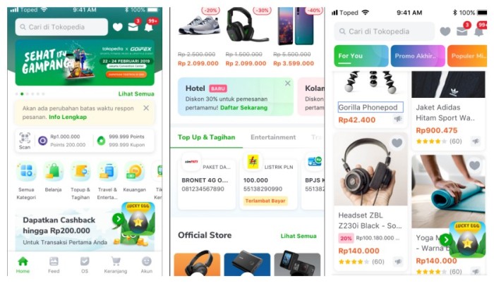
After we got the design wireframe, we start to breakdown tasks and convert the images above to the architecture blueprint that we will work on it on the image below.
As you can see from the picture above, we got three parts, namely Banner, Channel, and Mega Feed sections. Each element has its challenges. Before I explain further, we decided to use AsyncDisplayKit to layout every component except for the WrapperScrollView component. The main reasons we chose to use that framework are due to accessible design and secure collaboration. Since we write code instead of XIB. We can skip frustration during the conflict, and it can achieve 60fps (Yes, it’s our most significant consideration).
Okay, back to 3 parts that I was talking about before. The banner part has a background that blurred from the image we got from the banner. It looks pretty straightforward, but under the hood, we have image processing on that. First, we need to blur the background image generously. Back in 2014, Apple shares how to blur the image with high-performance image processing here, so we start to use it. Secondly, the background should have a parallax effect when users scroll, to give the best user experience we added a little piece of code.
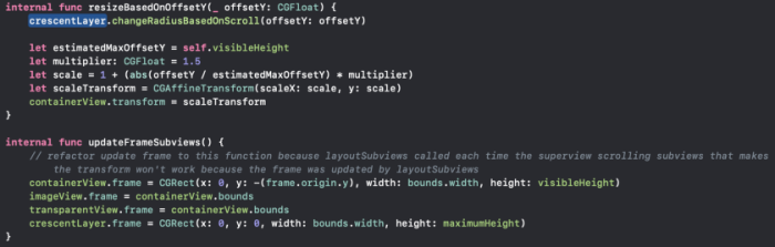
The second part, which is the Dynamic Channels part is a list of the component to support any Business Unit in Tokopedia (Currently we have nine elements on that, e.g., Flash Sale Component). This section must be able to be updated frequently because the chance is there is new content every hour. So to avoid wasteful rendering, we need to identify and differentiate change on every component. Here IGListKit comes to the party to give a joyful on our apps.
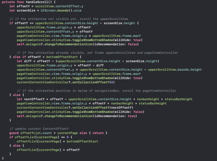
And the last part is Mega Feed. This part has Tab that should stick on top when it reaches the bottom of NavigationBar. Also, this part has infinite scrolling and Mosaic layout on that. We will talk about how we built it in another article, and now I want to share the sneak peek of code for the stick part.
The Result
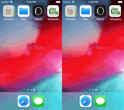
As you can see from the image above, on Home built with React Native, we got page load time 1.3 seconds and if you noticed when the first load there is a white blank page before the homepage showing up. When using iPhone 5, that white blank page is annoying for users. The white blank shows up because when the first time opens the page, it has to load the React Native Bundle before it starts rendering. React Native has too many steps before it getting loaded 😠
On the other hand, Native won the competition as it should be. We got page load time 0.60 seconds and no white blank on that. Also when we were trying to stress test scrolling, the average FPS that we got when using Native is on 40–55fps, that’s pretty awesome, now even iPhone 4S can run our apps smoothly 🍺
Final Words
The journey does not end yet! We are still improving the homepage performance, but our decision to leaving React Native on the Homepage was the best decision we ever made. We know there is Flutter come to the stage so that the future will be about hybrid technology. Still, our native platform knowledge is the most important above all! Hybrid could make life easier, but to do complicated things, go back to the root! So let’s Focus on Consumer to Make it Happen, Make it Better. 🍻